Skip to main content
Kimi Gao
首页
导航
阅读
图书
杂志
简刊
论文
访谈
博客
关于
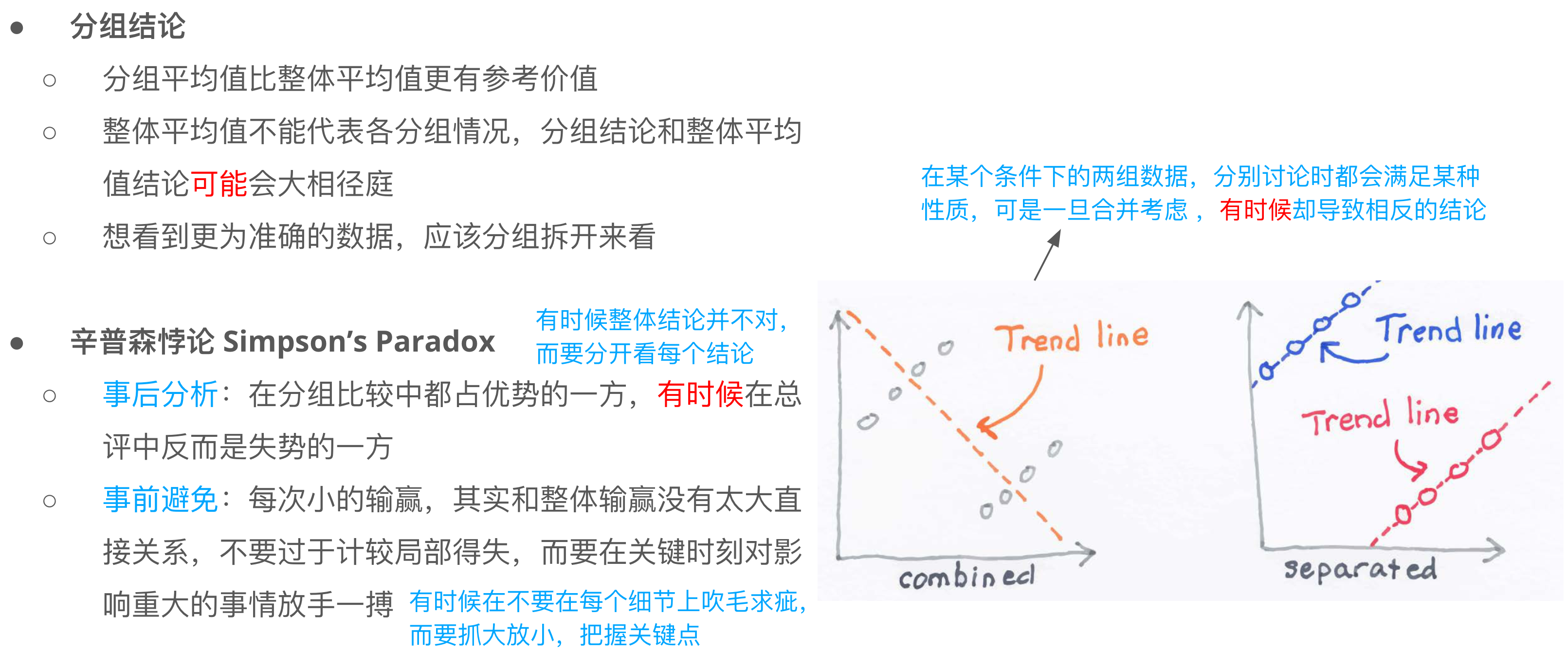
分组结论和辛普森悖论
April 2, 2025
· One min read
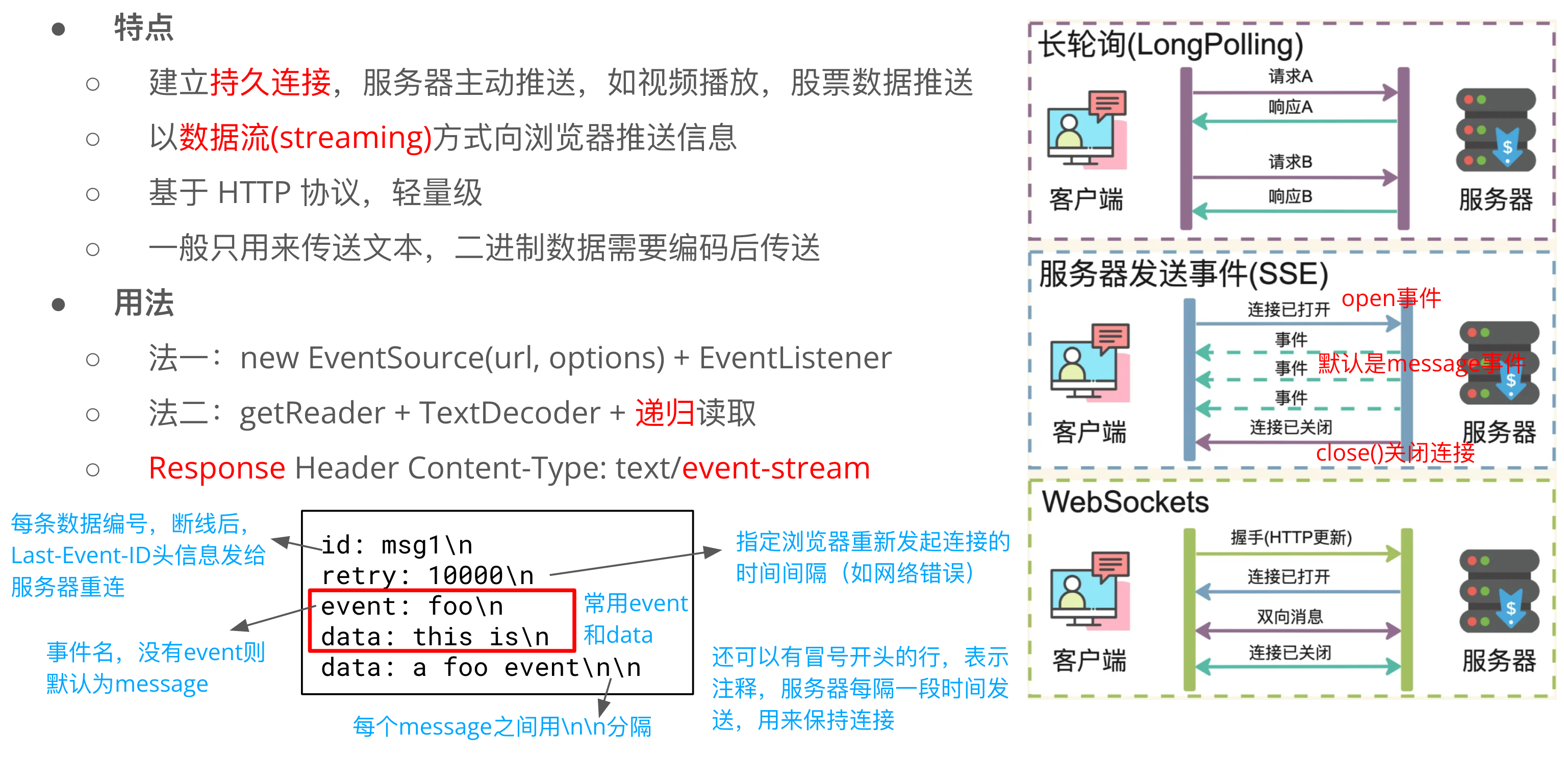
SSE: Server-Sent Events
April 1, 2025
· 3 min read
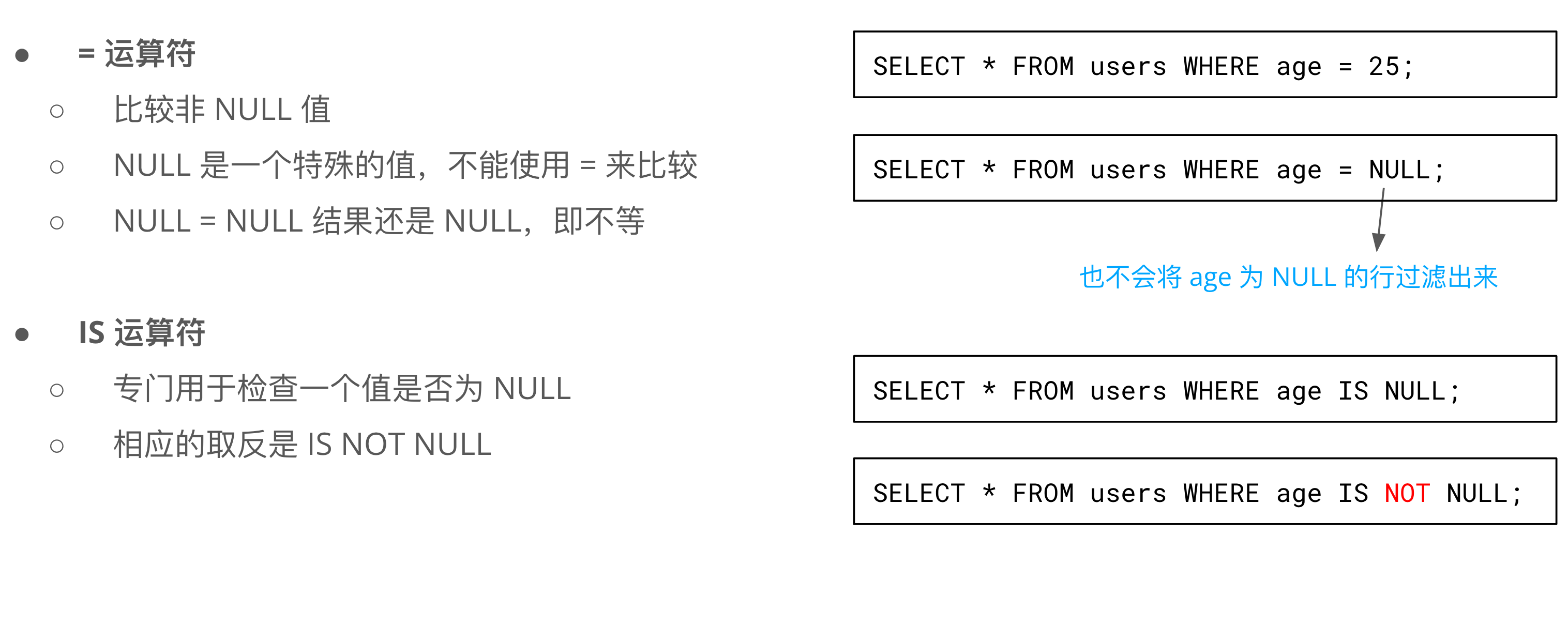
SQL IS 和 = 区别?
April 1, 2025
· One min read
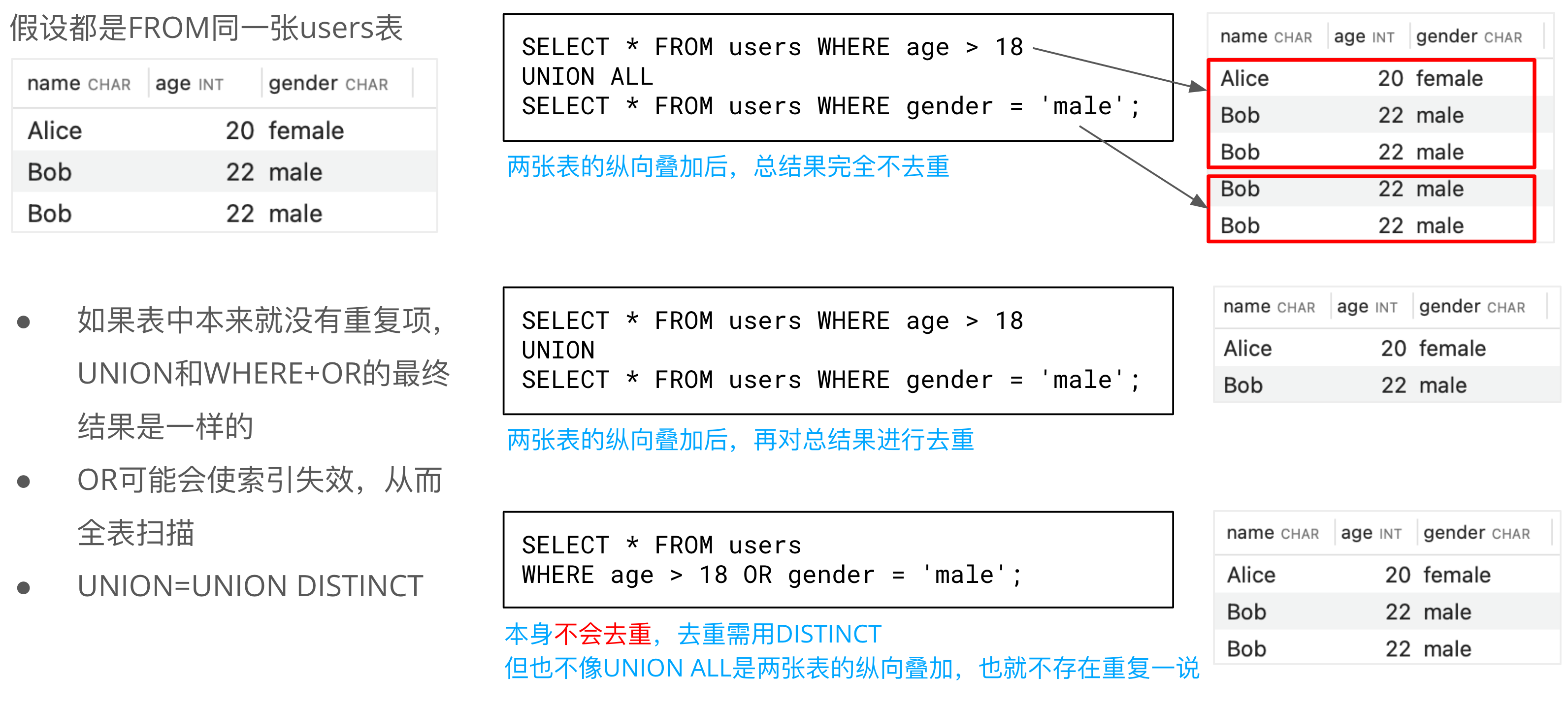
SQL UNION 和 WHERE OR 去重差异
March 29, 2025
· One min read
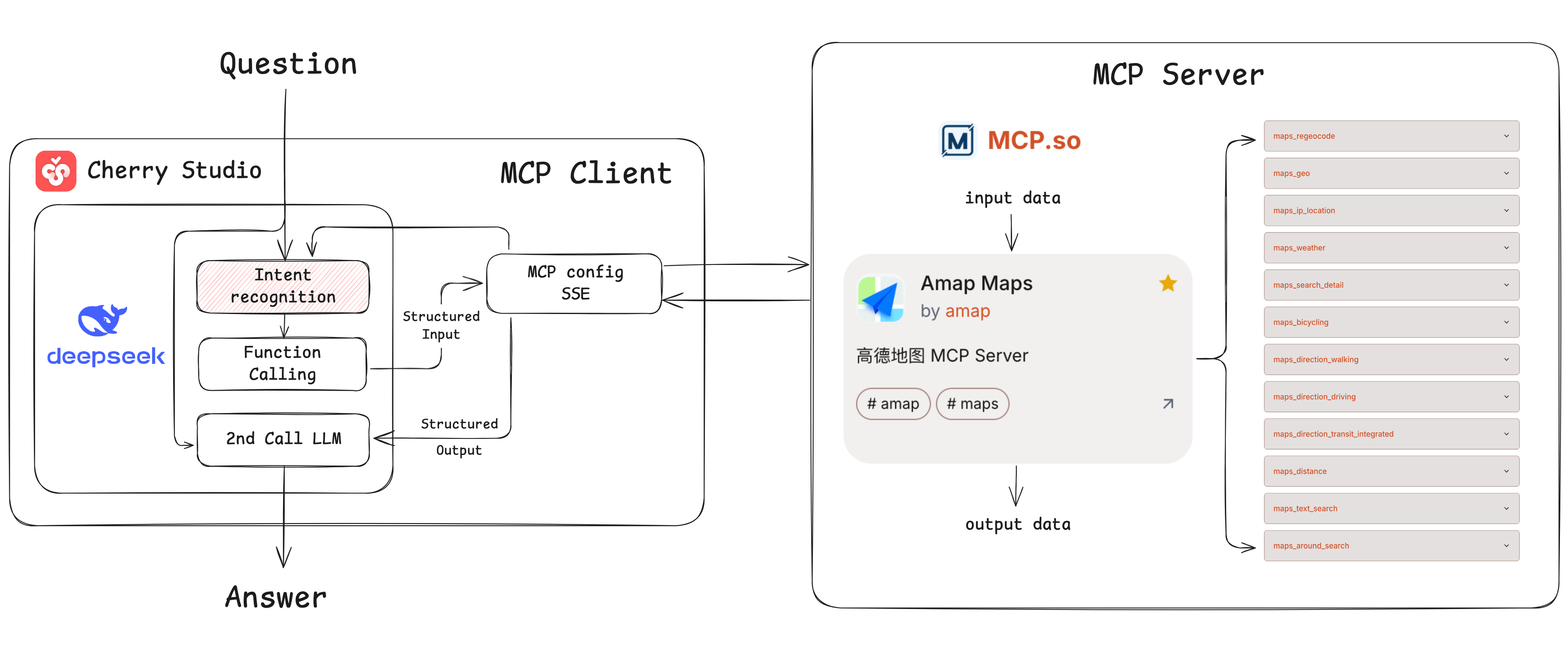
MCP Example: Route Planning Using Amap Maps
March 28, 2025
· 2 min read
Function Calling + Example
March 26, 2025
· 2 min read
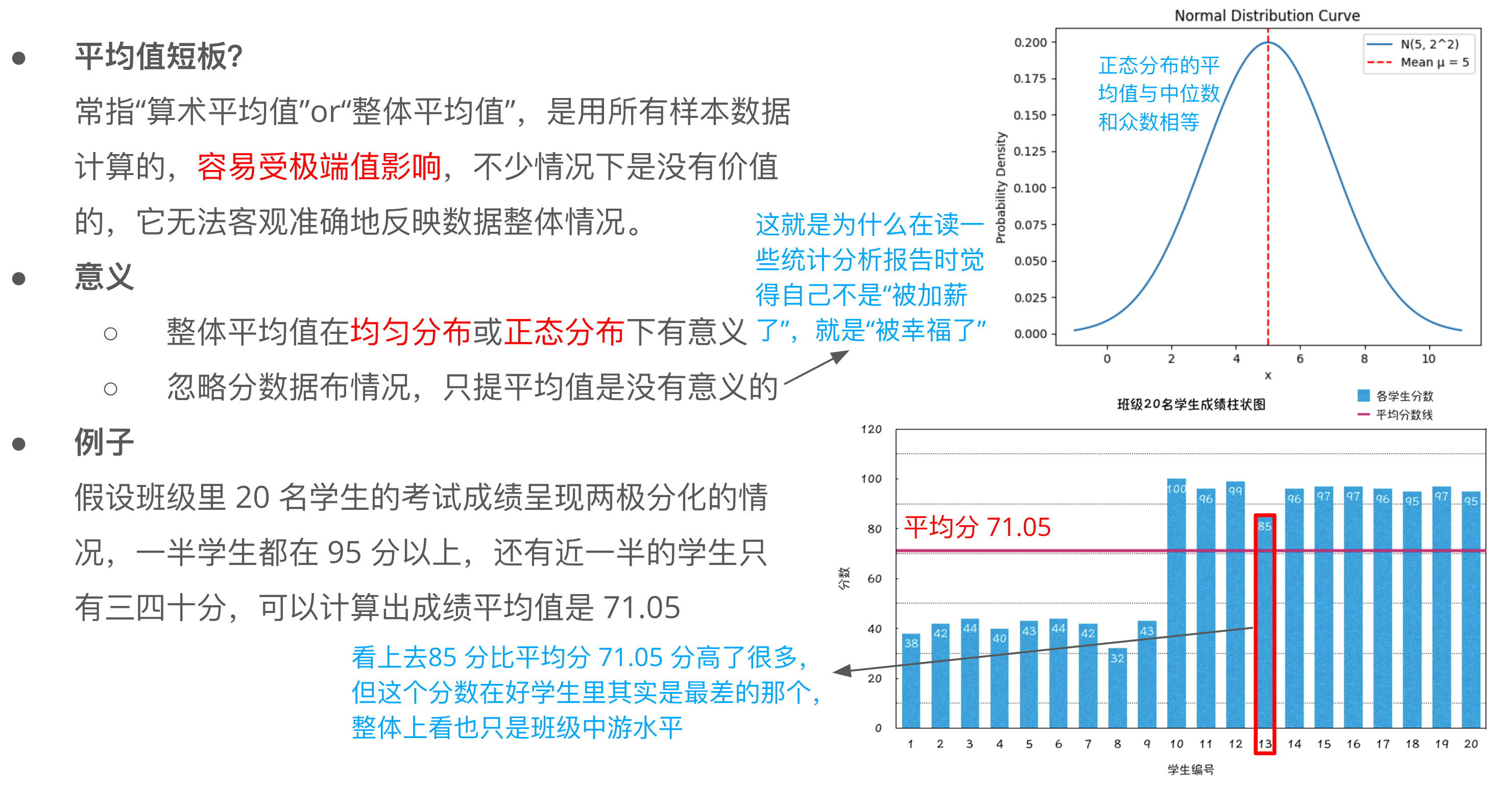
平均值与数据分布
March 24, 2025
· One min read
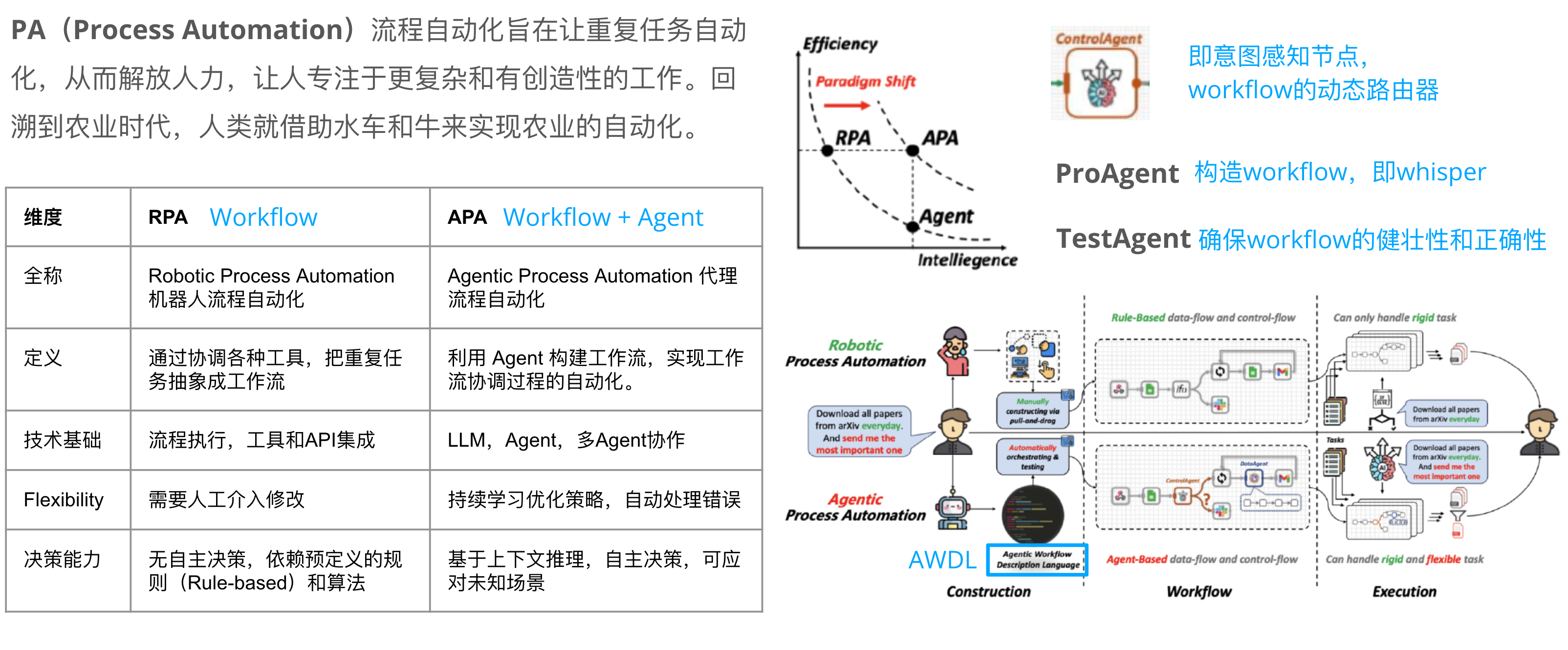
RPA v.s. APA
March 22, 2025
· 7 min read
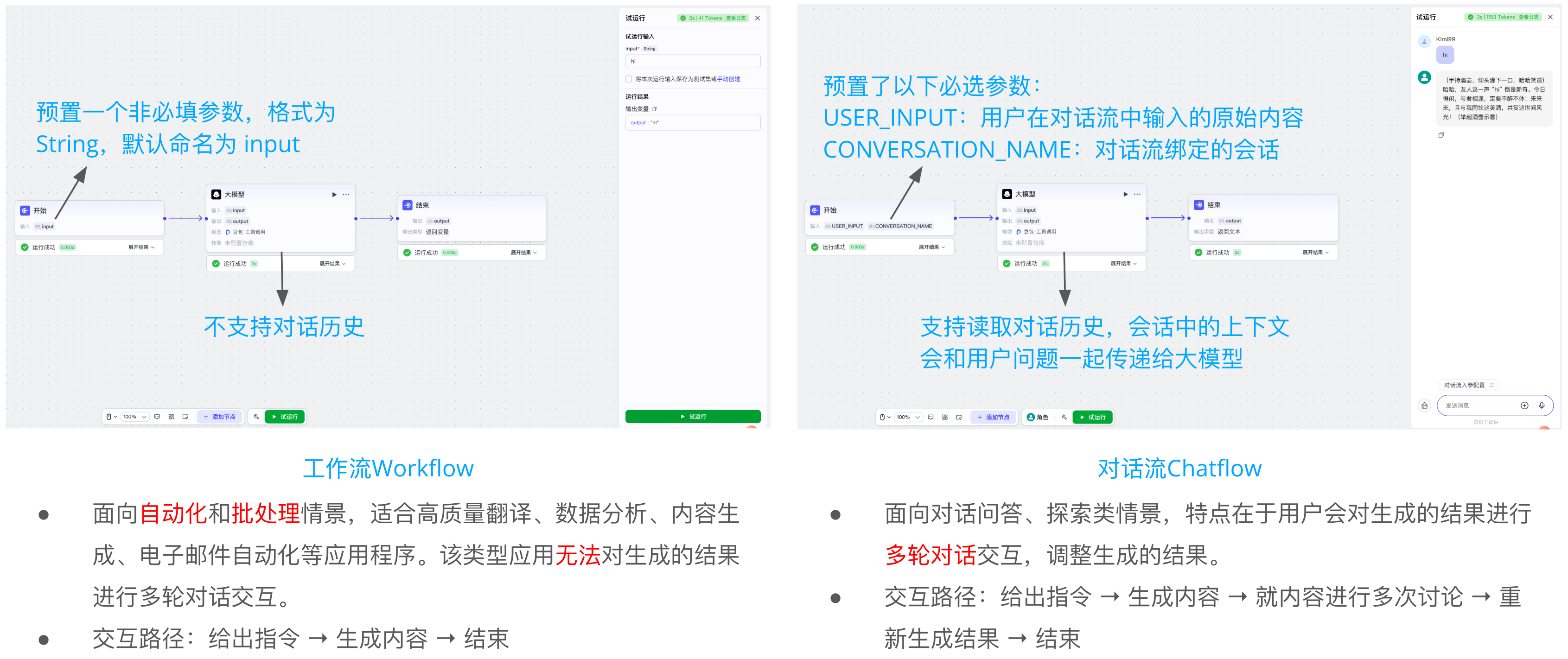
Workflow v.s. Chatflow
March 19, 2025
· One min read
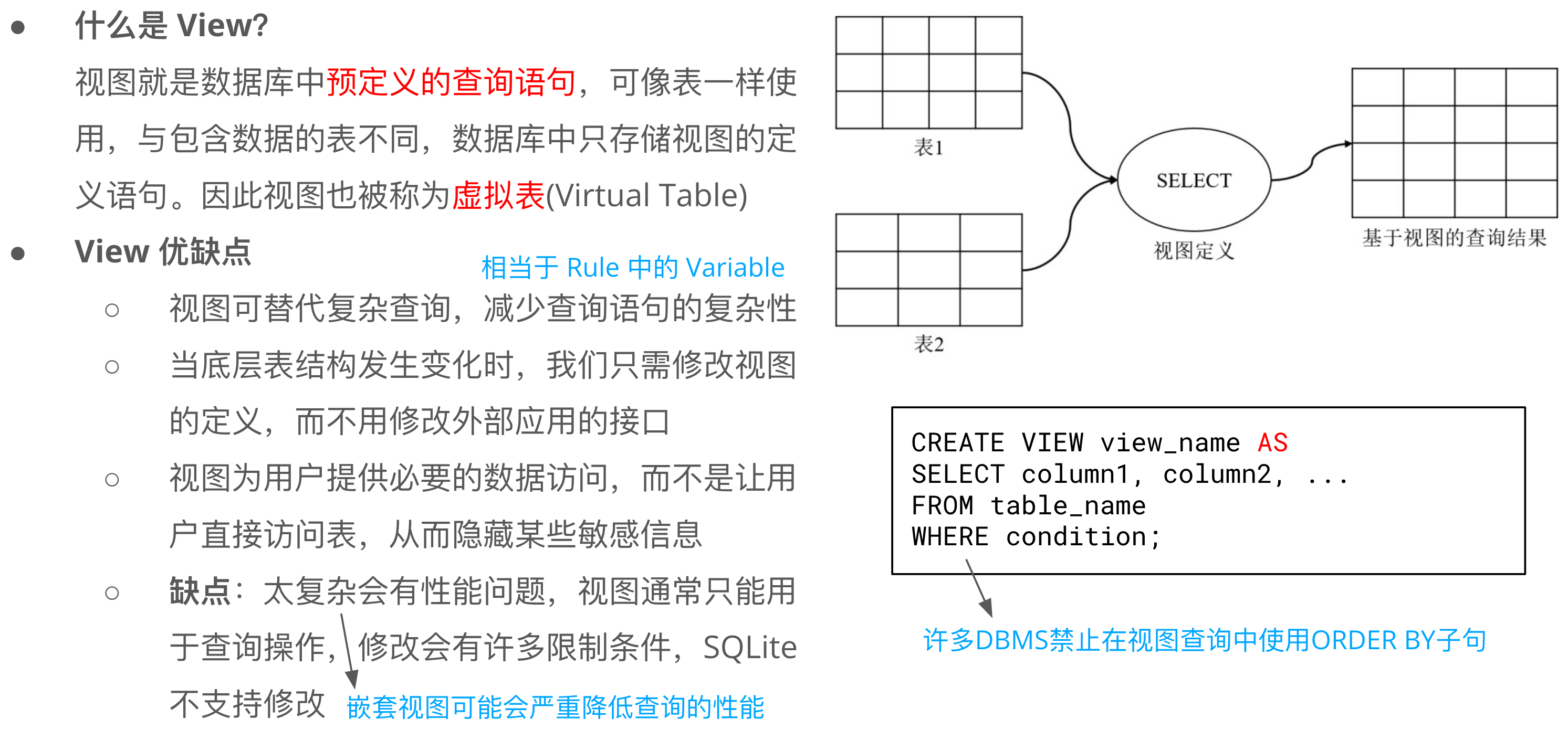
SQL View 视图
March 19, 2025
· One min read
‹Newer
1
…
20
21
22
23
24
…
32
Older›
发文趋势
月
年
近 12 个月 · 共 181 篇
10
11
12
1
2
3
4
5
6
7
8
10
9
近 1 个月分类榜
1
Electron
3
2
Pi
3
3
DeepSeek
2
4
🔁
Agent Loop
2
5
👀
Agent 认知
2