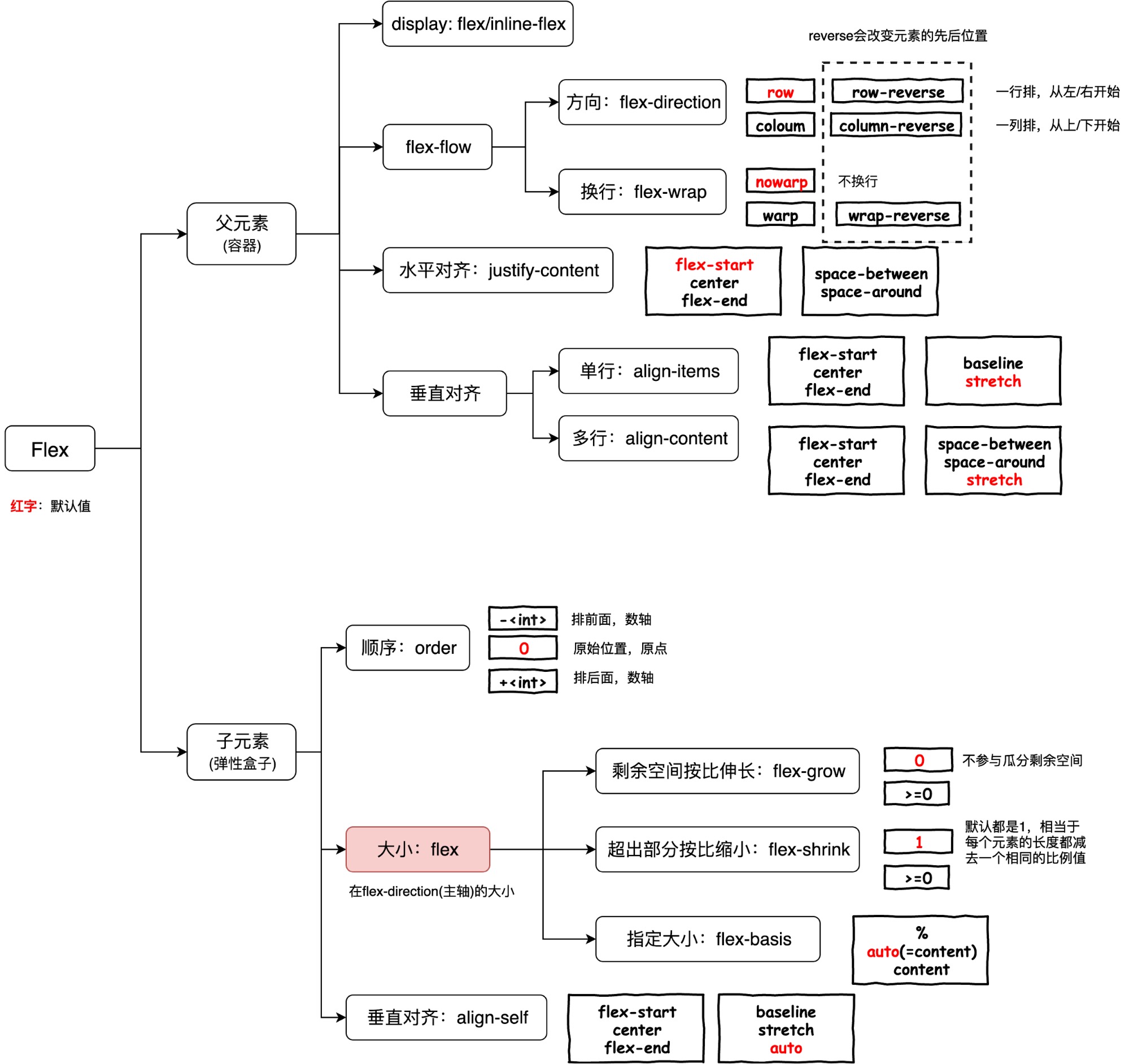
CSS Text Break Line Ellipsis
常用换行属性
在 CSS 中,处理文本过长自动换行的问题通常涉及到几个不同的属性,这些属性可以帮助你控制文本的显示方式,确保它们在容器内适当地换行。以下是一些关键的 CSS 属性,你可以用来管理文本换行:
-
word-wrap
(或overflow-wrap
): 这个属性可以设置为break-word
,允许单词在需要时可以被拆分换行,以避免文本溢出容器。word-wrap: break-word;
在 CSS 中,处理文本过长自动换行的问题通常涉及到几个不同的属性,这些属性可以帮助你控制文本的显示方式,确保它们在容器内适当地换行。以下是一些关键的 CSS 属性,你可以用来管理文本换行:
word-wrap
(或 overflow-wrap
): 这个属性可以设置为 break-word
,允许单词在需要时可以被拆分换行,以避免文本溢出容器。
word-wrap: break-word;
px 像素(Pixel),相对长度单位。本来 px 还是很好理解的,但是由于 Retina 屏让 px 变得扑所迷离,也是在移动端 Web 开发的时候不得不跨越的一个坎。我们先了解一下两个概念:
独立像素 = 物理像素
独立像素 < 物理像素
Online demo: http://www.liquidapsive.com
Before introduction on responsive and adaptive design, let's start by Static and Liquid which are basis of responsive and adaptive design.
Static layouts are the traditional web: one design that sits in the center of the page and requires horizontal scrolling if the window is too small for it. M dot sites (m. site is a website that's specifically designed for mobile devices, and exists on a separate subdomain) are the traditional answer to this, providing a wholly separate site for a lower resolution - and all the work of creating a separate site.
"自适应网页设计"的核心,就是 CSS3 引入的 Media Query 模块。
它的意思就是,自动探测屏幕宽度,然后加载相应的 CSS 文件。
<link
rel="stylesheet"
type="text/css"
media="screen and (max-device-width: 400px)"
href="tinyScreen.css"
/>
上面的代码意思是如果屏幕宽度小于 400 像素,就加载 tinyScreen.css
文件。
流实际上是 CSS 中的一种基本的定位和布局机制,流和现实世界的水流有异曲同工的表现。CSS 世界的“流”似乎就是按照现实世界的“水流”创造的。
CSS 世界构建的基石是 HTML,而 HTML 最具代表的两个基石 <div>
和 <span>
正好是 CSS 世界中 block-level 和 inline-level 的代表,它们对应的正是图中的盛水容器中的水和木头。
level | box | display | formatting context |
---|---|---|---|
block-level | block box | block | BFC |
list-item box | list-item | ||
table box | table | ||
flex box | flex | ||
grid box | grid | ||
inline-level | atomic inline-level box | inline-block, inline-table, inline-flex, inline-grid | BFC/IFC(透明) |
inline box | inline | IFC | |
CSS 对其归属说得比较模糊,毕竟在 CSS 诞生前 table 就存在了。可以简单理解为(特殊的)block-level | table-row-group (tbody), table-header-group (thead), table-footer-group (tfoot), table-row (tr), table-column-group (colgroup), table-column (col), table-cell (td, th),table-caption (caption) | TFC(CSS2.2), 在 CSS2.1 中是 BFC,还没有 TFC 的概念 | |
others | none, initial, inherit, unset |