HTTP Request Methods
· 阅读需 6 分钟
枚举(Enum)类型经常被用于取值在一定范围内的场景,比如一周只能有七天,角色权限设计等。枚举类型变量使用enum字段来定义,枚举成员的值可以是数字或者字符串,并且枚举成员是只读的。
枚举按照类型划分,主要分为以下三种:
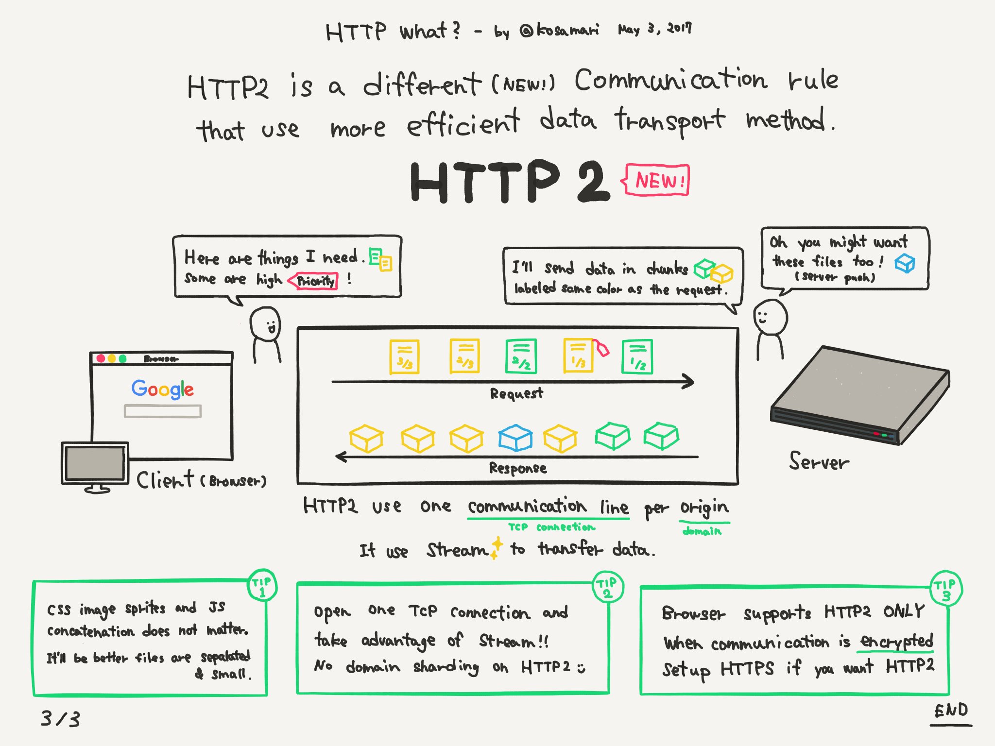
HTTP/2 主要目的是提高网页性能,最近几年比较火,将其单独抽成一块讲。2015 年,HTTP/2 发布。它不叫 HTTP/2.0,是因为标准委员会不打算再发布子版本了,下一个新版本将是 HTTP/3。
目前还有不少服务还是 HTTP/1.1,NodeJS 也是从 v10 才将 http2 转正。Express5.x 才开始支持 http/2。
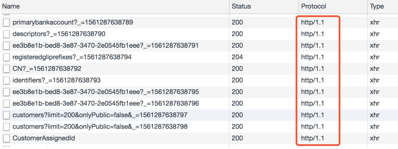
可以打开谷歌首页看看,基本上都是 http/2 协议,简写成 h2
TS 允许将一些不同类型的变量相互赋值,虽然某种程度上可能会产生一些不可靠的行为,但增加了语言的灵活性,毕竟它的祖宗 JS 就是靠灵活性起家的,而灵活性已经深入前端的骨髓,有时会不得不做一些妥协。
当一个类型 Y 可以被赋值给另一个类型 X 时,我们就可以说类型 X 兼容类型 Y。
X (目标类型) = Y (源类型)
原始类型的兼容性主要关注三点:
| npm | yarn | 功能描述 |
|---|---|---|
| npm run | yarn run | 运行 package.json 中预定义的脚本 |
| npm config list | yarn config list | 查看配置信息 |
| npm config set registry 仓库地址 | yarn config set registry 仓库地址 | 更换仓库地址 |
| npm init | yarn init | 互动式创建/更新 package.json 文件 |
| npm list | yarn list | 查看当前目录下已安装的所有依赖 |
| npm login | yarn login | 登录你的用户名、邮箱 |
| npm logout | yarn logout | 退出你的用户名、邮箱 |
| npm publish | yarn publish | 将包发布到 npm |
| npm test | yarn test(yarn run test) | 测试 |
| npm bin | yarn bin | 显示 bin 文件所在的安装目录 |
| yarn info | yarn info | 显示一个包的信息 |
curl -o- -L https://yarnpkg.com/install.sh | bash
如需升级,再次运行此命令,然后会出现以下信息:
/Users/xxx/.yarn already exists, possibly from a past Yarn install.
> Remove it (rm -rf /Users/xxx/.yarn) and run this script again.
根据提示,由于已经安装了 yarn,所以需要先删除~/.yarn文件,然后再重新执行该命令,即可安装最新版 yarn。

