Network visualization
Network visualization is a dynamic tool for displaying connected data. Leveraging this tool opens up plenty of possibilities for organizations across industries to gain more insights more quickly, to improve teamwork and collaboration, and more. This section explores the ins and outs of network visualization: what it is, how it works, and why it’s an asset for businesses across use cases.
What is network visualization?
Network visualization, also referred to as graph visualization or link analysis, is a method of visually representing relationships between various elements or entities within a network. This type of visualization simplifies the complex nature of the network, making it easier to understand, analyze, and interpret: essentially, a picture is worth a thousand words.
How network visualization works
Network visualization is a way of representing connected data, or data modeled as a graph. To better understand graphs, let’s take a quick look at graph analytics. Graph analytics is a way of analyzing not only individual data points but also the relationships between them. Graph data consists of a set of nodes - also called vertices - and edges - also referred to as links or relationships. A node is a single data point that represents a person, a business, an address, etc. An edge represents how two given nodes are connected: a person owns a business, for example.
This data is stored in a graph database. Analysts and data scientists can then work on that data using graph algorithms.
In a network visualization, nodes and edges are displayed visually.
A network visualization can represent anything from a social network to a network of servers to an entire transportation network.
The power of network visualization lies in its ability to make sense of complex data sets. By visually mapping out the connections within a network, it becomes much easier to spot patterns, identify outliers, understand clusters, and uncover insights that would be nearly impossible to detect in raw, tabular data.
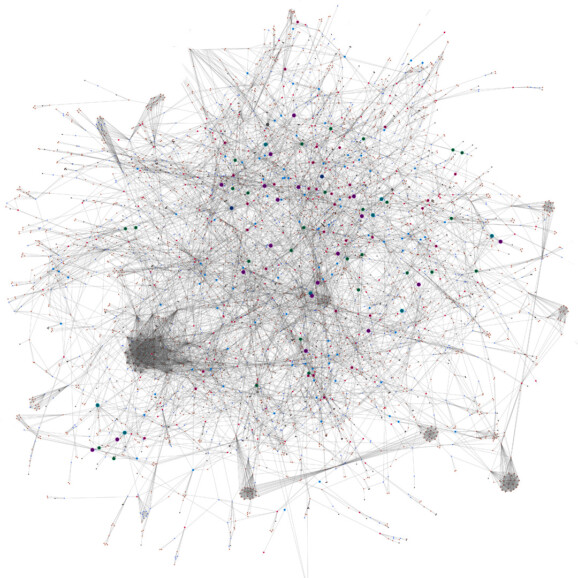
A network visualization displaying nodes and edges.
Adapting network visualizations to your needs
The aesthetics of a network visualization are essential for the information in the network to be comprehensible. A well organized visualization that fits the purpose will help you better find and understand the information and insights you need.
Layouts are how the nodes and edges are arranged in a network visualization. This is usually done using an algorithm that determines how these elements are arranged and grouped together. For example, a force-directed layout positions nodes depending on the force that’s acting on them, with more connected and consequential nodes positioned towards the center of the visualization. Layouts can also minimize edge crossings, create symmetrical edges, etc.
Some tools can also group similar edges together, which can help make large network visualizations more readable.
Beyond simply presenting a static picture, modern network visualization tools also offer interactive features, enabling users to explore their networks dynamically: zooming in on areas of interest, filtering information, and even modeling the potential impact of changes within a network.
Why is network visualization important?
Network visualization comes with several advantages that can be a game-changer for teams working across industries.
Gain insights faster
The human brain processes visual information much faster than textual information. Visualizing a network makes it much faster to understand key information around relationships within a dataset, hierarchies of information, etc.
Intuitive understanding of your data
Exploring connected data within a visualization is much more intuitive than trying to sort through spreadsheets or tables. When understanding connections is important to the work you’re doing, visualizing is a fast and powerful way to analyze your data.
Flexible and dynamic
A network visualization tool can give you a dynamic way to visualize, explore, and understand your data. Playing around with how you represent your data lets you see both the big picture at a glance, and dive into granular detail. This flexibility enables you to gain key insights faster and more effortlessly.
Easily shareable insights
The saying “a picture is worth a thousand words” is certainly true when it comes to network visualization. An image is a more impactful way to share key findings and information with decision-makers and other stakeholders.
Network visualization use cases in finance
Anti-money laundering and anti-fraud
AML and fraud analysts depend on many types of data to identify suspicious activity. For any given case they may need to look at customer information, claims details, financial records, or lists of politically exposed persons (PEPs) or sanctioned individuals or organizations. Network visualization is an efficient way to detect suspicious connections or patterns within heterogeneous data. It’s also an intuitive way to investigate fraud rings and criminal networks.
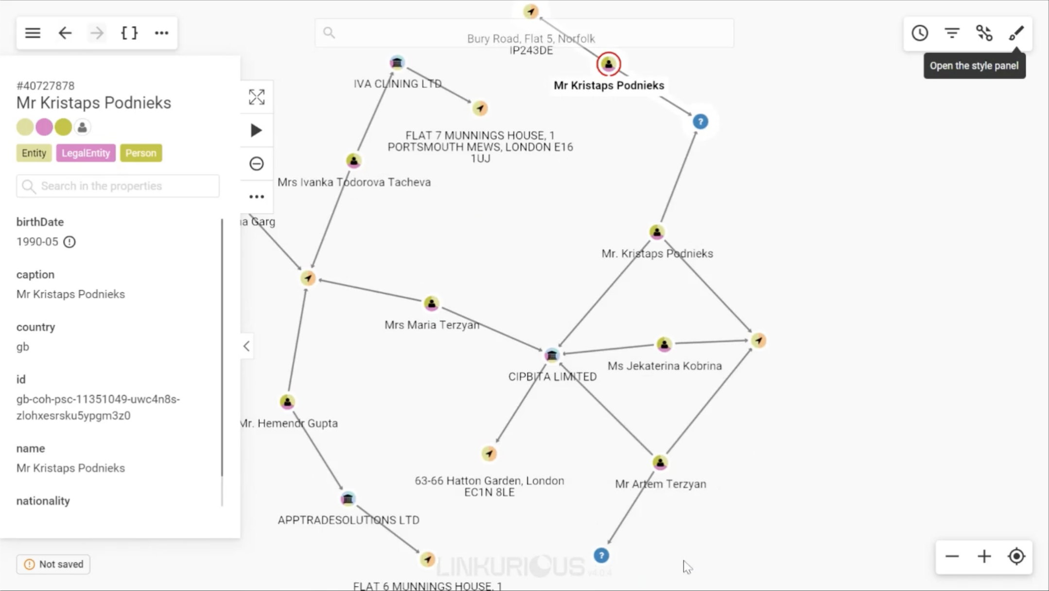
Network visualization can help you track down networks of fraudsters, sanctioned entities, PEPs, and more.