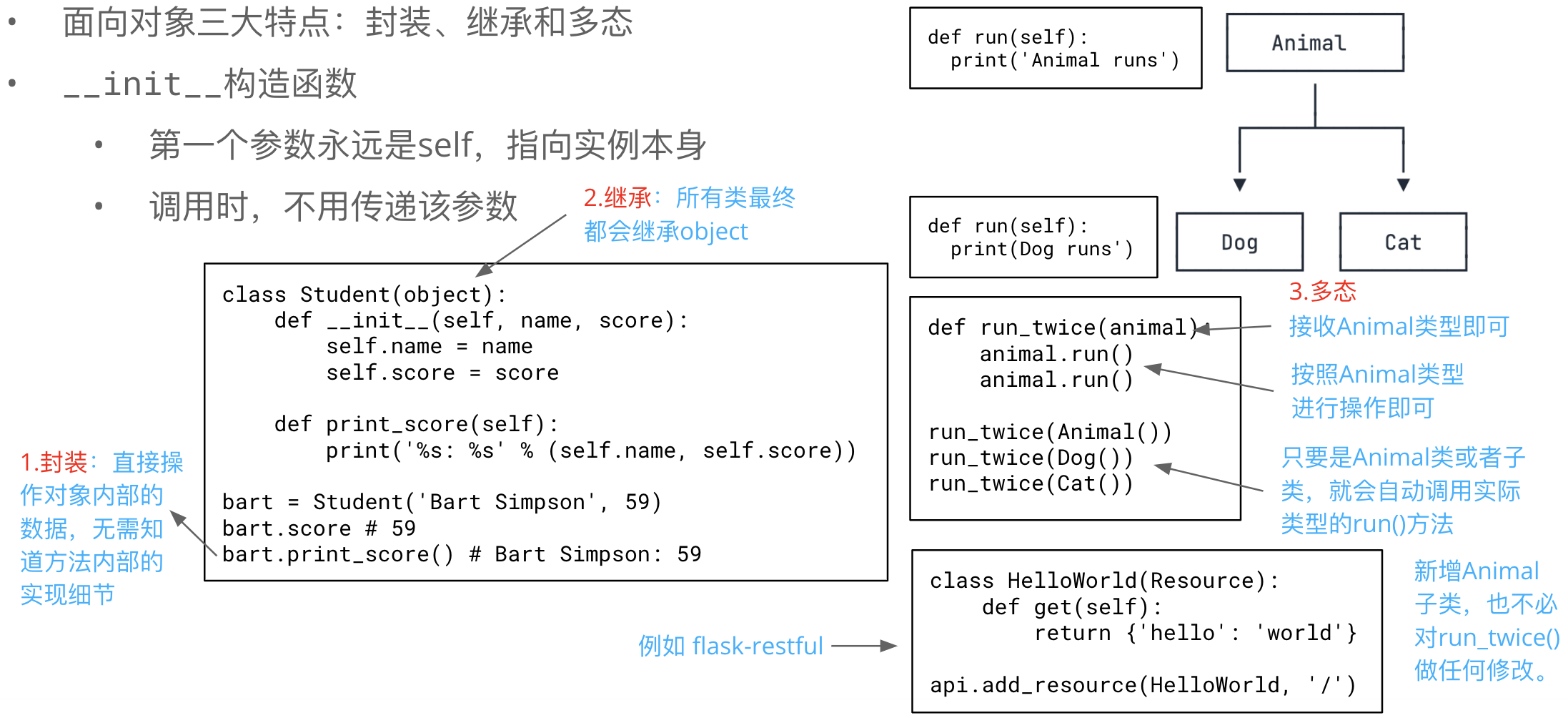
Python 面向对象编程特点?
· One min read
Linux Nginx 配置文件在 /etc/nginx/sites-available/default
sudo apt install nginx # ubuntu
Ubuntu 安装之后的文件结构大致为:
/etc/nginx 下,并且每个虚拟主机已经安排在了/etc/nginx/sites-available下/usr/sbin/nginx/var/log/nginx 中/etc/init.d/ 下创建了启动脚本 nginx/var/www/nginx-default (有的版本 默认的虚拟主机的目录设置在了/var/www, 请参考 /etc/nginx/sites-available 里的配置)px 像素(Pixel),相对长度单位。本来 px 还是很好理解的,但是由于 Retina 屏让 px 变得扑所迷离,也是在移动端 Web 开发的时候不得不跨越的一个坎。我们先了解一下两个概念:
独立像素 = 物理像素独立像素 < 物理像素
Online demo: http://www.liquidapsive.com
Before introduction on responsive and adaptive design, let's start by Static and Liquid which are basis of responsive and adaptive design.
Static layouts are the traditional web: one design that sits in the center of the page and requires horizontal scrolling if the window is too small for it. M dot sites (m. site is a website that's specifically designed for mobile devices, and exists on a separate subdomain) are the traditional answer to this, providing a wholly separate site for a lower resolution - and all the work of creating a separate site.